⇍ February 4th, 2007 ⇏
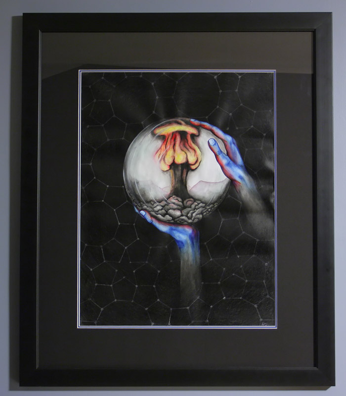
For Christmas this year Susan gave me a charcoal/chalk piece that she did for an assignment on "sustainability" for school. I like it a lot, so I decided to have it professionally framed. Luckily, Angela had a 25% off coupon for our favourite framing store, so I was able to get a deal.
First, I decided to go get some high quality fixative from the local art store to preserve the work. The fixative did a good job, but it did dull the whites slightly, which makes the background stand out less compared to the way it originally looked. Oh well, hopefully Susan doesn't mind. At least now the artwork should last for several centuries, barring any unforseen collapses of civilization or nuclear annihilations.
Anyway, with the help of the framing people I decided on a black frame with a black matte to go with the dark nature of the imagery, and we put in a second blue matte just peeking out from behind the black to accentuate the blue hands.
We hung the picture in the bedroom, and it seems to fit quite nicely. It was difficult to get a photo without any reflections in the glass. Angela and I finally resorted to covering the tripod with a black sheet, and holding another black sheet up behind the camera. We couldn't completely eliminate the ceiling reflection though.
I read about one photographer who painted a room in his house neutral grey, including the floor and ceiling, so that he could get good photos of objects without distracting reflections, and by playig with lighting he could make the background either black or white to suit the mood of the photo. I will have to add that to the list of things to do if I ever move to a bigger house.
Technical details: This was shot with my Rebel XT + kit lens at ISO 200, f/4 for 0.6 seconds.
Gorgeous!

I think you made a wise framing choice. The hint of blue really
brings out the colours in the piece.
-- Alix at 1:11am, Thursday February 8, 2007 EST
Niiiiice.

(Sue, don't hate me but...)  ...I actually kind of like the effect
the fixative has created. When I first saw the work as it was unwrapped at Xmas
my eye was drawn to the pattern of stars, pentagons, and decagons; but now that
the white lines are a bit dulled the central image stands out more, to me
anyway.
-- Jenny at 9:33am, Thursday February 8, 2007 EST
Very nice work!

Hmmm.. paint a room neutral grey you say... something to think
about... but Kim would probably kill me...
-- Aravind at 12:35pm, Thursday February 8, 2007 EST
I agree I like it much better with the pattern faded for a number of reasons.
Looks good Mike, nice photo! I'm glad you are enjoying the piece.
-- Sue at 2:06pm, Monday February 12, 2007 EST
Hosted by theorem.ca